Knowing the bill went up
is not energy management.
Most energy monitoring stops at a number and a trend line. The useful question is narrower: which system, on which floor, at which hour, and what is it costing us against what it should. That needs metering that reconciles, attribution that goes as deep as the instrumentation allows, and a tariff that matches the invoice.
Six layers between a meter and a decision.
Each one is where most energy management projects quietly stop — and each one is the reason the next is worth anything.
What the estate actually looks like.
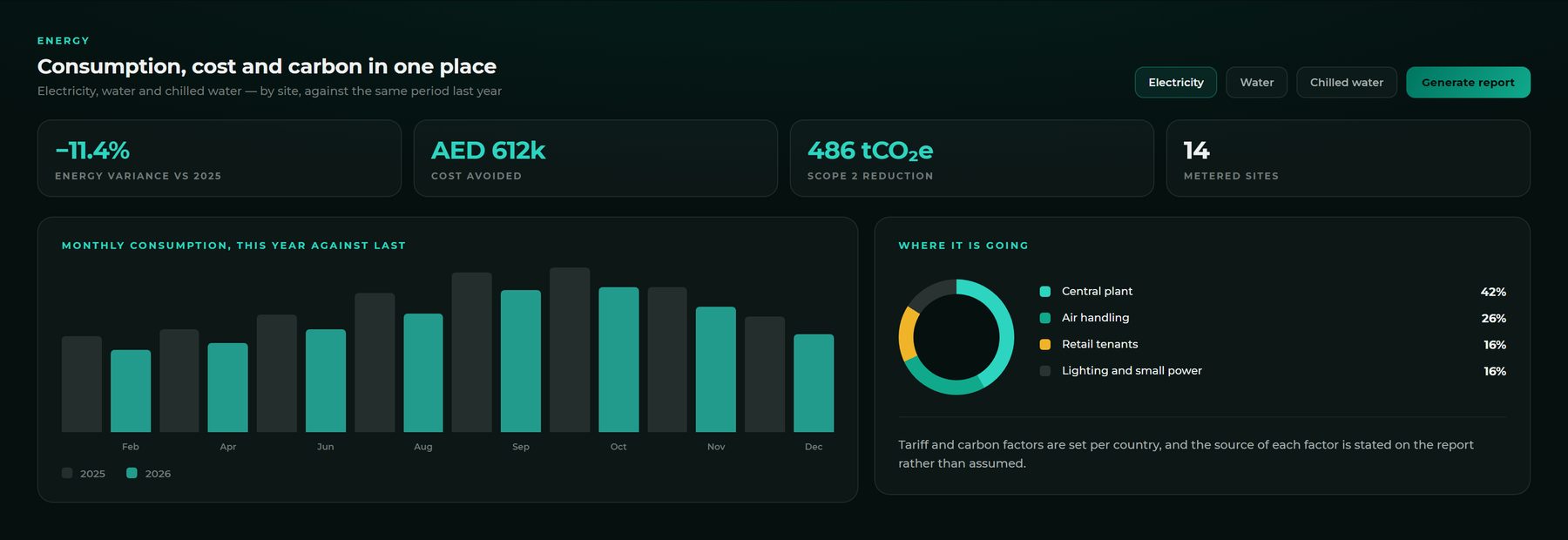
Consumption, cost and carbon in one place.
Electricity, water and chilled water across the estate, against the same period last year. Tariff and carbon factors are set per country, and the source of each factor is stated on the report rather than assumed.
Dashboards built by the people who read them.
Consumption in kWh, pump run hours, an hour-by-day heatmap, boards ranked against each other — dragged onto a grid and pointed at live data. No ticket to raise, no release to wait for, and no export that is stale by the time it is opened.
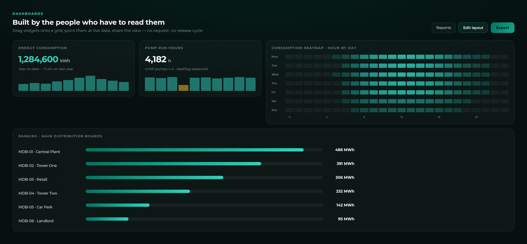
Interface representative. Figures are illustrative demonstration data.
The number, wherever the conversation happens.
Consumption, cost and carbon on the same live data as the desktop — because “how are we tracking?” is rarely asked at a desk.
- This period against the same period last year
- Energy, cost and emissions from one figure
- Site by site, worst first
- The same permissions as everywhere else
 MR
MRBy site
Measuring is not the same as proving.
Consumption down 11% year on year is a fact about two numbers. It is not evidence that anything you did caused it — the weather moved, occupancy moved, and the building is not the same building it was. When a saving has to survive a finance review it belongs in measurement and verification, where a weather-normalised baseline does the comparison properly and the model has to pass published acceptance tests before its number counts.
Start with what the meters already know
If your buildings already have main and sub-meters, they can usually answer far more than they are being asked at system and building level — that part is configuration, not capital. Going below it, asset by asset, is a metering decision, and the honest first step is a survey that tells you which assets are worth instrumenting and which are not.